Friday, March 24, 2017
High School Trailer
This assignment was to frame for frame, shot by shot, recreate a high school movie trailer. In my group of three we first started out our process by finding a good trailer to recreate. After a lot of deliberation we decided on the A-list. After this we created our story board and script using screenshots from the trailer. Creating a cast list was the hardest part but we learned to use the problems along the way and just go with it. If I were to do this differently I wish we created each scene more carefully if we had more time outside of school together as a group. But I liked our actors and had fun. This was a very hard experience with a lot of stress but it will make me a better collaborator even with tough groups.
Tuesday, March 21, 2017
Marks and Symbols
Logos are one of the most important things as a company to communicate there brand to viewers. Symbols are small pictures without type or text. A logo is the words that identify the brand. Putting these together making a combination mark creates a relationship for the brand. A company can use just a mark or just a logo on products or they can be used together.
Symbol


Logo

Combination Mark

Symbols are a quick picture that viewers can easily remember the "face" of the brand.
Symbols must flow and attract others to it.
Symbols mostly use one color to maintain syplicity and not overwhelm the final combination mark.
The most important thing I learned is that both can be used separately and together but still maintains the same feel as the brand. This will be very valuable to me during my graphic design future making logos for clients.
Symbol


Logo
Combination Mark

Symbols are a quick picture that viewers can easily remember the "face" of the brand.
Symbols must flow and attract others to it.
Symbols mostly use one color to maintain syplicity and not overwhelm the final combination mark.
The most important thing I learned is that both can be used separately and together but still maintains the same feel as the brand. This will be very valuable to me during my graphic design future making logos for clients.
Wednesday, January 25, 2017
Original Music Video
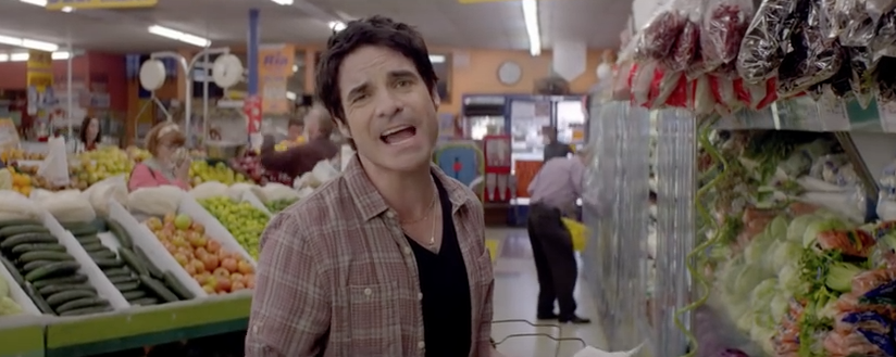
This video was an amazing story with a funny scenery. For our video we also used the grocery store as our main place to shoot at. The creator did a great job using the girlfriend in different places. The creator also used a mariachi band in the store which was amazing and a great asset to the video. There video could have improved quality looks like it was shot on a bad camera. We were very inspired from this video and from the actors emotions. We are going to try to recreate it as best we can.
https://www.youtube.com/watch?v=GSBFehvLJDc

https://www.youtube.com/watch?v=GSBFehvLJDc
Friday, January 20, 2017
Posters
In todays economy posters play a role in changing the future. Posters consist of colors, fonts, and other visuals. A poster gives information and illustrates information. Posters inform, simulate, activate, mobilize, expound, provoke, motivate, and convince.
When making a poster there are certain laws to follow.
Step 1:The poster must be easy to read, understandable, and stick to the memory of the reader.
Step 2:Having significant lettering with the graphics, lettering should help to give out information quickly and simply.
Step 3:The object of a poster needs to be clear and be expressed by significant shapes, and colors. All these elements must flow together.
Step 4: This law states that color can emphasize the object of social, economic, political, and cultural campaigns. Color can make a poster pleasing and make all elements flow.
I learned that if all elements of the poster does not flow together the viewer can forget and disregard all the information on the poster. A good poster s well organized, layed out well, and have a good color scheme.
Tuesday, December 20, 2016
Semester 1 Video Final
1 in 2000
This project was to use a student in the class, interview them about a story they had and make a video over it. This video took about a week. The challenges I faced were getting my voiceovers to sound smooth and fluent. Since this was only our second project I learned a lot about the importance of voiceovers, the 6 shot system and working with other people. Some feedback I was given was that the lighting was great but I should trim lots of shots down. In my re edit I made everything tight and work well together. This was one of my first videos so its not my best but I learned a lot.https://youtu.be/dbsm_DgiEzg
Feature Story 2
This project was a feature story about an organization. I choose my volleyball club, South Kc. In total this video took about 2 weeks to film and edit. A challenges I faced was my go pro was not working within my first volleyball practice and had to get it working for my next upcoming practice. Along the way I learned you can make an amazing video with not only a regular camera but also a go pro, which I will definitely be using in the future. Some feedback I was given was when I introduced the players in my voiceover I should put a shot of them to introduce them. In my re edit this is exactly what I did. This is one of my favorite videos I've ever produced and loved the way it turned out and so did my teammates.https://youtu.be/_fiesJKal0M
In class I used my time very wisely, using every second I could to improve my video. When I thought I was done I would ask others to watch my video and critic me so I could improve my project. Outside of school was a lot of calibration and filming, I spent at least 10 hours over this semester filming and working outside school.
My strengths in making videos are definitely editing, collaborating, and filming lots of different and interesting shots. I maximize these strengths by using my talent in every video. My weaknesses in video are my voiceovers. To improve I need to work with my talking and editing skills.
What I liked most about this semester is being able to do our videos about whatever we wanted and leaving a lot of room for creative freedom. I wouldn't change anything differently! My overall taking from this class was skills using a new kind of camera, teamwork skills, and my love for video. One goal for next semester is to give 100 percent into every video I make.
Friday, December 16, 2016
Semester 1 Graphic Design
Raccoon Postcard
This project was to create a raccoon using a tutorial and make a background for it to lay out on. This raccoon needed to be somewhere on your postcard and everything had to be made in adobe Illustrator. The last requirement was to use written typography, scan it, and place this in your post card as well. In total this project took about 3 weeks. The biggest challenge I faced was the written typography. I don't have the best hand writing but I went slow and used a ruler. Along the way I learned time management, and ow to use almost every tool in Illustrator. I mostly worked with the shapes tool and pen tool, but along the way I learned how to use swatches, create a color pallet, and the line tool. Some feedback I got was the color pallet matched very well with easter, and others told me to add the bunny ears onto my raccoon, and to add something other than the eggs. After i received this feedback I added bunny ears, and also changed all the colors of my raccoon to pink and changed some of the parts to make it look for like a bunny. My overall opinion was that it looked very cute and kid friendly.


Vectored Self Portrait
This project was to use our head shots that we took in the beginning of the year and use them to create a vectored self portrait in Illistrator. This project took about 2 weeks. Some challenges that I faced was trying to create dark and light highlights. Along the way I learned how to use the pen tool accuratly and presisly. Some feedback I received was to use the eyedropper tool to find the exact shade of color my skin, eyes, and other features were. I changed all of the colors to match the ones in the original headshot using the eyedropper tool. My overall opinion was that I was very proud of the outcome and I really think it looks like me.

Infographic
This project was to pick a topic and create graphics and text to create a well thought out infographic.This project took about 3 weeks. The challenges that I faced was getting the original layout to fit all my topics and text. I learned the importance of hiarche and fonts. My feedback that I received told me that I needed to simplify my work and take out most of the text. After I got this feedback I imediantly started to re read and simplify my information. My overall opinion was that I worked haRd and I loved the way my polar bear graphics turned out.

In class we got lots of work days and I used them very wisley. I never had to come in after school and got every project turned in on time. I though I was done many times during this semester but every time I knew I wasn't. When I had this extra time I would check everything constantly trying to improve anything and everything that I could. When I went home after receiving a new project I would research this project and ideas about what I could do.
My strengths as a graphic designer are using the pen tool to make creative graphics and finding good color schems. I maximize my strengths by trying my best and constantly asking for help and feedback by not only by the teacher but my peers to.
My areas of improvement include understanding each tool in illistrator and completing each project to the best of my ability. I can improve this by asking for help and using all time possible.
This semester I loved having the ablitly to pick your own topic and have creative freedom. If I could change one thing it would be to reconize how much time I had and to create accordingly. I will take away lots of adobe skills and hoe to create almost everything in illistrator. One goal I have for next semester is everything I make needs to be to the best of my ability. I love graphic design and am looking forward to what we are doing next semester.
Monday, December 5, 2016
Feature Story #2
For my second feature story I did it over the volleyball club South Kc. I wanted to show what an amazing club and environment it is every day. I showed B-roll of volleyball and coaching also about the conditioning.
My narrative lead was very strong and a powerful voice for this video because I am a part of this club and wanted to speak very passionately about it.
For my first interview I did it over 2 players on the 17 team Oliva, and Jaden. I wanted these girls to tell about there experience and they complimented each other nicely because of there friendship and teamwork.My second interview was a parent of South Kc. I wanted to tell this point of view because the viewers are also parents. This was very strong because of how strongly she felt about her daughter being on this volleyball club.
Shooting my video was very fun with my team. It was especially fun using my go pro and using and editing amazing shots for my b-roll.
My class enjoyed my video but also felt the sound was off at certain pints whited I fixed the levels.
I loved shooting and editing this video in all the different aspects. I hope you enjoy my video and learn a lot about this amazing volleyball club, South Kc.
https://www.youtube.com/watch?v=_fiesJKal0M
Subscribe to:
Comments (Atom)